
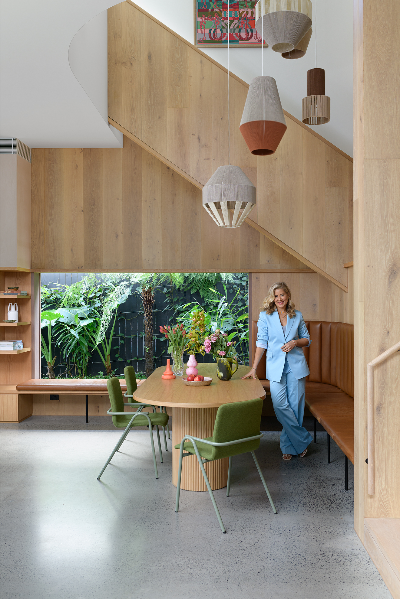
#GuestSpeaker: Carlene Duffy from CarleneDuffyStudio
Photography by Mindi Cooke
What an amazing couple of months we have had at Design School with such a talented group of guest speakers coming in to chat with our students.
Last month, our trainer Holly Miskimmin had the absolute pleasure of hosting Carlene Duffy for a conversation on colour, lighting and the lived-in art of interiors. Known for her layered and soulful approach, Carlene generously shared insights from her own projects and professional journey, offering our G31 learners (who were studying Module 8: Colour & Lighting), plus some of our recent grads, a masterclass in how to use colour and light with intention.
“It’s not colour people tire of - it’s high contrast!”
Carlene opened with this gem, explaining that bold colour isn’t the problem, contrast is. When clients ask for “just neutrals”, she digs deeper. Neutrals can have depth and richness when layered tonally, with texture and materials doing the heavy lifting.
‘Commit, don’t dabble.’
Carlene’s advice: if you’re going to use colour, commit to it. Build a tonal story across walls, textiles and furnishings in order to create a cohesive and calming environment.
Photography by Mindi Cooke
‘Let light set the tone’
Light, Carlene stressed, is always the first consideration. A space flooded with natural light will make whites feel fresh and alive, but in a dimmer room, white can fall flat.
“In low-light rooms, I’ll often lean into warm colours such as mustards, ochres and timber floors, because that warmth creates life where light is lacking.”
This balance between colour and light is where the atmosphere of a room is truly shaped. Carlene leans into warm colours (mustards, nudes, ochres) and warm materials (timber floors, timber furniture) to bring spaces to life.
Projects we love
Surf Shack
A palette that feels like summer every day. Tonal blues, sandy textures, and a sense of play that captures joy and relaxation. We love the Surf Shack here at Design School, as it’s proof that considered design can be relaxed and full of soul. With layered materials, repurposed pieces, and an art driven narrative, it strikes that magic balance between coastal ease and creative sophistication.

Photography by Mindi Cooke
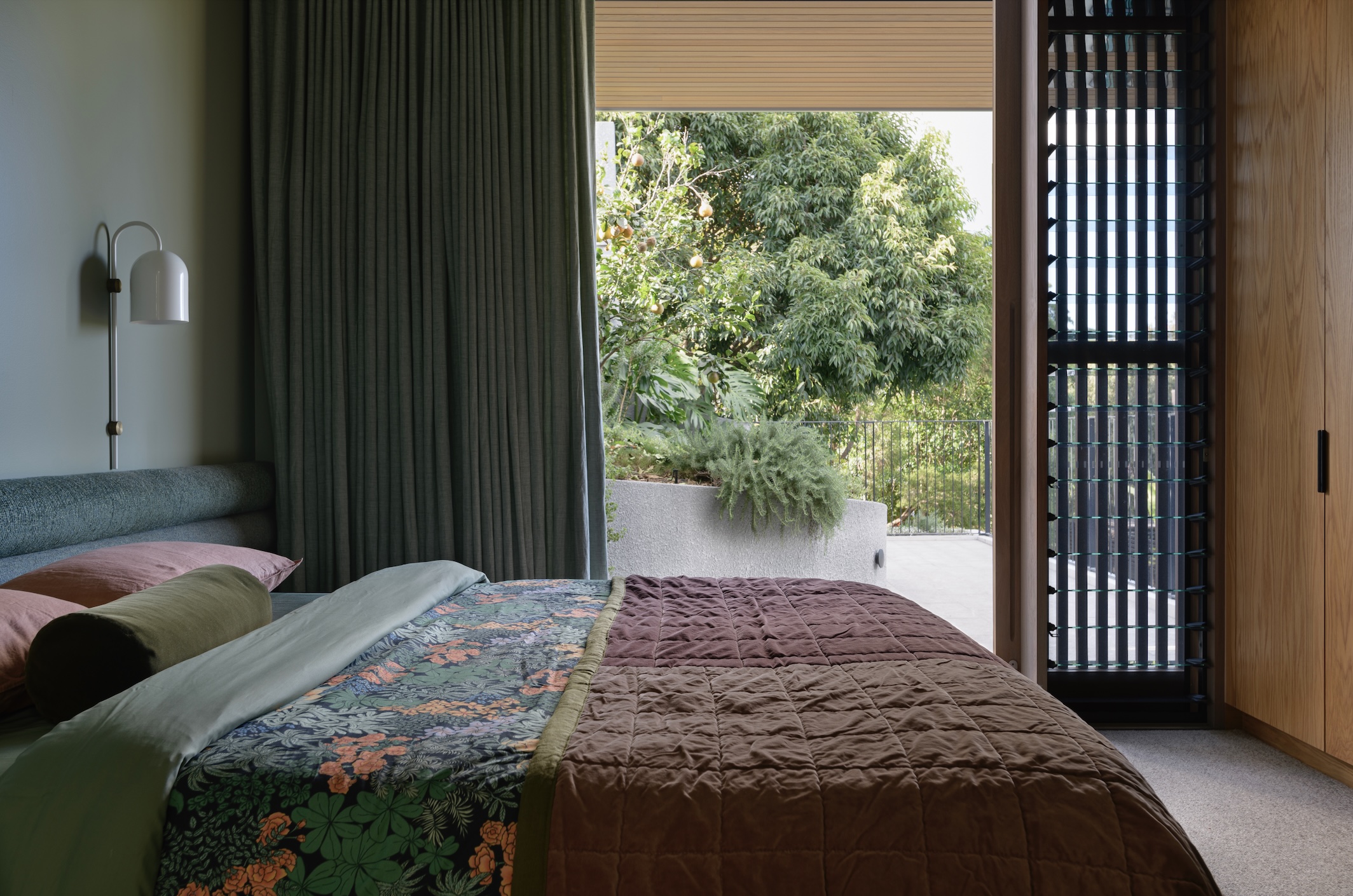
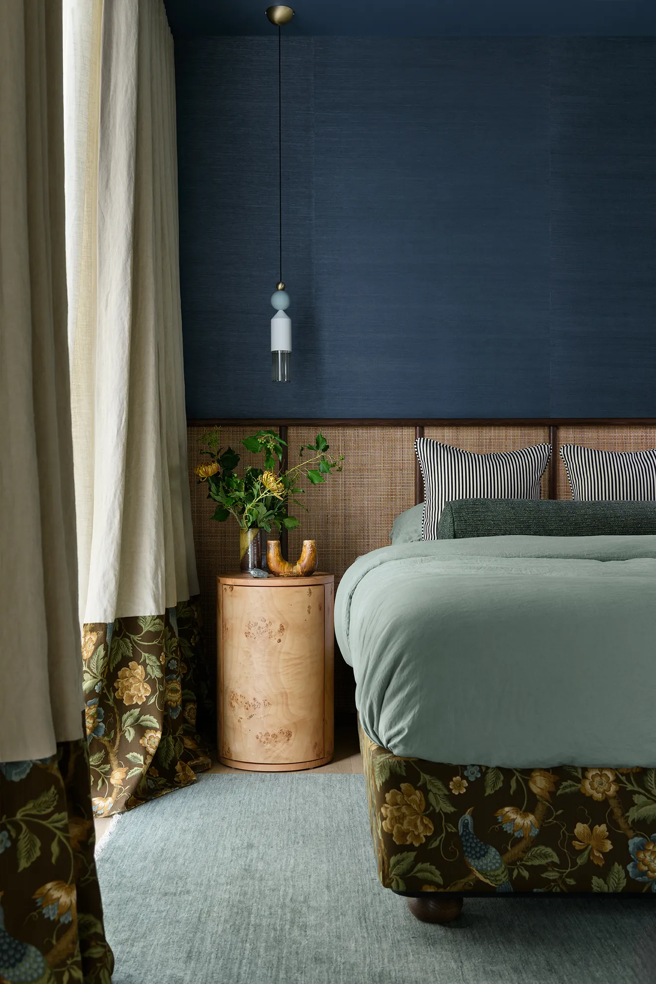
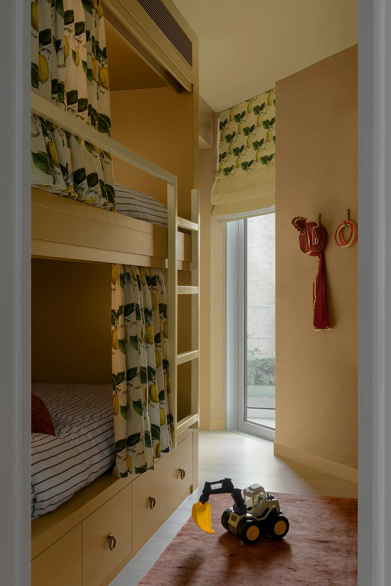
Berry House
A 1920s Queenslander reimagined for a vibrant family of five. Warm tones ground the downstairs spaces, while cooler hues upstairs respond to the natural light. Standout features include a custom pink island bench, American oak joinery and layers of texture, making the home feel both character-filled and contemporary.
Photography by Mindi Cooke
“Colour doesn’t always have to be loud to be powerful.”
Photography by Mindi Cooke
Practical wisdom
Some golden nuggets from Carlene’s session:
- Commit to colour. Don’t just add a “pop” as it can feel jarring. Build a tonal story instead.
- Let materials lead. Consider starting with a piece of fabric, rug sample, or artwork, and draw your palette from there.
- Customise where you can. Cushions, upholstery, and soft furnishings are opportunities to add originality.
- Test paint properly. Always double-coat, dry fully, and test on the right substrate (plaster vs. timber makes a difference!).
- Work with your reps. The clearer your brief, the better (and faster) their help will be.
Our takeaway
Carlene’s warmth, honesty and practical wisdom reminded us that design is about feeling as much as it is about aesthetics. For our G31 students, and for anyone working with interiors, her words are a reminder to:
- Honour the psychology of colour
- Let light be your first tool
- Commit with confidence
- Think tonally, not contrast-heavy
- Always design for how a space feels
Thank you, Carlene, for such a generous and inspiring session.
#DesignSchoolBlog
Hello Design Lovers! Welcome to the Design School Online Blog.
Get ready for a behind-the-scenes adventure with Design School Online.
We'll share what sparks our creativity, from our fantastic learners to our brilliant graduates.
Love what you see? Join the DSO Mailing List to be the first in line for news, future events and courses.
Recent Posts
Categories
All Categories